
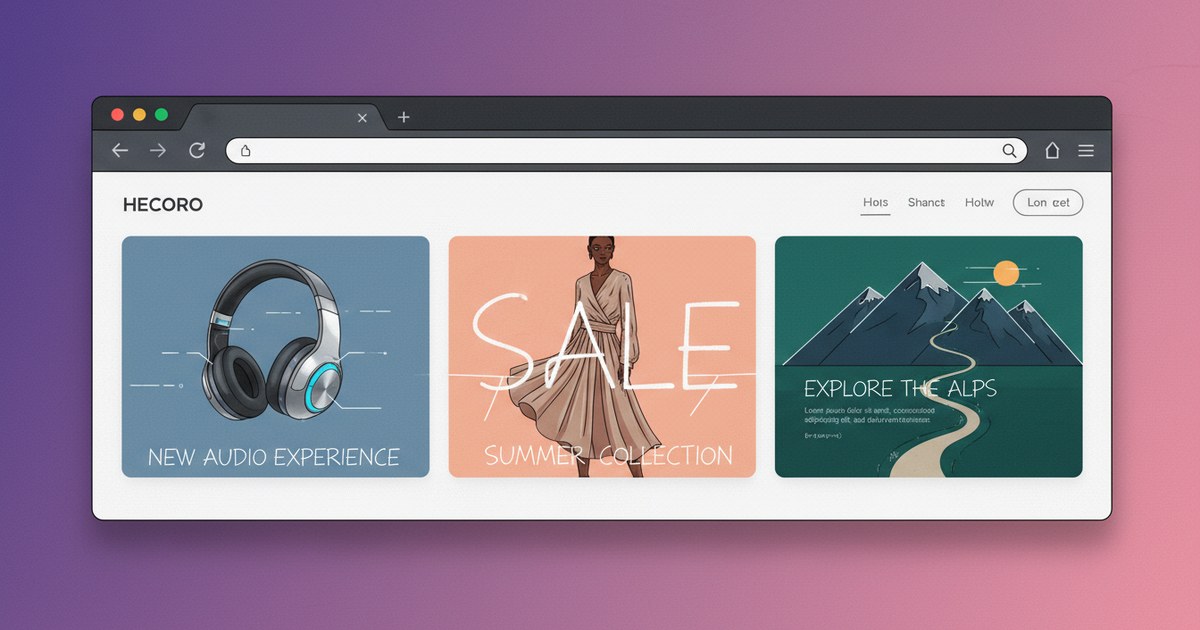
OG Image Examples: Design Patterns That Work on Every Platform
Good og image examples all share one quiet trick: they look intentional, not accidental. You've seen the opposite plenty of times, a blog post shared on Slack with a stretched screenshot, or a product link on X showing a logo floating alone on a white background like it got lost on the way to a business card. That's what happens when nobody designed the image for the rectangle it actually has to live in.
This guide is the design half of the og:image conversation, not the pixel-and-format half. If you already know your image needs to be roughly 1200 by 630 pixels and you're staring at a blank canvas wondering what to put in it, you're in the right place: five composition patterns you can copy, the "safe zone" concept that keeps your image from getting clipped, and the two questions clients setting up their first og image design ask most, what about text and what about the logo.
What Makes a Good og:image, Really
An og:image is the picture that shows up when someone shares your link on X, Facebook, LinkedIn, Discord, Slack or iMessage. It's pulled from the og:image meta tag in your page's HTML, and every one of those platforms crops, resizes or thumbnails it differently before it ever reaches a reader's screen. On X specifically, whether your card renders large or as a small square thumbnail depends on the twitter:card value, not the image alone, our twitter card types guide covers the difference between summary and summary_large_image if you want that piece sorted out too.
A strong one does three things at once. It represents the actual page, not a generic brand splash slapped on everything. It survives being shrunk to postage-stamp size, which is what happens in a Slack message or an iMessage bubble. And it has a clear focal point, one thing the eye lands on first, rather than several competing elements.
Think of it like a book cover shrunk to a thumbnail in an online store listing. A cover designed at full size, with a small author name and a busy illustration, turns into visual mush at thumbnail size, while covers that sell at that size use one bold shape, one readable title, high contrast. Your og:image needs the same discipline, just for a link preview instead of a bookshelf.
Five og:image design patterns you can copy
I'm not going to hand you a gallery of pretty pictures with no explanation, because that's what every other page on this topic already does. Instead, here are five repeatable patterns, who each one suits, and the one mistake that trips people up on it.
Pattern 1: product or UI screenshot
This is the SaaS default, and Calendly is a good example of it done well: a clean screenshot of the actual product interface, sometimes with a light browser frame around it, sometimes without. It works because it shows the thing you're selling instead of describing it.
Who it suits: software products, dashboards, tools where seeing the interface builds trust faster than any headline could.
Composition tip: crop tight on the useful part of the screen. A full browser window with menu bars and a dozen tabs open just adds noise nobody can read at thumbnail size anyway.
The pitfall: a raw, unedited screenshot at the wrong resolution stretches or pixelates once the platform resizes it. Export it at a size that already matches your target dimensions instead of letting the platform scale a screenshot taken at random size.
Pattern 2: bold headline over a photo or gradient
This is the classic blog and news pattern: a short, punchy line of text sitting over a photo, illustration, or a simple color gradient. Medium and Dev.to both lean on variations of this for article shares.
Who it suits: blog posts, opinion pieces, anything where the headline itself is the hook.
Composition tip: keep the text to one line, maybe two short ones, and put it in the center-safe area (more on that shortly) so it survives cropping.
The pitfall: low contrast between the text and the background. White text on a light photo looks fine on your monitor and disappears completely once Slack renders it small and slightly compressed.
Pattern 3: brand color plus simple illustration
Notion is the reference point most people already know: a flat brand color as the background, one small, simple illustration or icon, minimal or no text. It reads as calm and consistent across an entire site because every page can reuse the same og image template with just the icon swapped.
Who it suits: documentation sites, portfolios, and anywhere consistency across many pages matters more than a unique image per post.
Composition tip: pick one accent color and one motif, then build a template so every new page takes fifteen seconds to generate instead of an hour in a design tool.
The pitfall: making the illustration too small or too detailed. A tiny, intricate icon on a huge flat field just reads as an empty square with a smudge in the corner once it's thumbnail-sized.
Pattern 4: product-in-context mockup
This is a device frame, laptop, phone, tablet, showing your product in a realistic setting rather than a flat screenshot. Linear and Vercel both use versions of this to give an abstract product a physical, tangible feel.
Who it suits: apps, especially mobile apps, where showing the product on a phone in someone's hand communicates "this is real and usable" faster than a screenshot alone.
Composition tip: keep the background simple so the device itself stays the clear focal point.
The pitfall: cramming the device into a busy scene with props, shadows and background clutter that competes with the actual product for attention.
Pattern 5: data or quote card
A big number, a short quote, or a single striking stat, set in large type on a clean background. This suits opinion pieces, research posts, or anything built around one compelling data point.
Who it suits: stats-driven content, opinion essays, case studies with one headline result worth leading with.
Composition tip: one number or one quote, nothing else competing for space. The whole point is that it's readable in under a second.
The pitfall: trying to fit the full context (source, date, caveats) into the image itself. That's what the page content is for. The image's job is to earn the click, not to be a footnote.
The safe zone: why your image needs breathing room
The "safe zone" is the center portion of your image, roughly the middle 80 percent, where you keep anything that actually matters: faces, text, logos, the focal point of a screenshot. The outer edge is where platforms crop differently, so anything placed right at the border is gambling on whether it survives.
Here's why this matters more than it sounds like it should. Meta recommends og:image files be at least 1200 by 630 pixels with an aspect ratio close to 1.91:1 "to display the full image in Feed without any cropping," and notes that anything further from that ratio gets cropped by Facebook's own layout (Meta for Developers, Images in Link Shares). Other platforms apply their own crop rules on top of that. A face or headline sitting near the edge on your monitor can end up half-cut on someone else's feed.
Practically, that means: center your subject rather than pushing it to a corner, leave real margin between text and the image border, and never put a face right at the top or bottom edge where a square crop is likely to slice through it. If you want to see exactly how your own image gets cropped on each platform, run your URL through our free checker and look at the previews for X, Facebook, LinkedIn, Discord, Slack and iMessage side by side.
Should your og:image include text?
Short answer: yes, commonly, and it's normal to see text baked into a social share image example. Longer answer: it needs rules.
Keep it short, one line or two, not a paragraph. Keep it high-contrast so it's still legible once the image gets compressed and shrunk to thumbnail size in a chat app. And never let the image be the only place your actual message lives. Your title and description meta tags carry the real copy that search engines and screen readers can access; the image is reinforcement, not the whole message.
That last point connects to something the accessibility community has pushed on for a while: baked-in text "can't be resized" and doesn't "adapt well to different screen sizes," and it's invisible to a screen reader unless described separately. The Web Content Accessibility Guidelines address this under Success Criterion 1.4.5, which says real text should be used instead of an image of text "except when a particular presentation of text is essential to the information being conveyed" (W3C WAI, Understanding SC 1.4.5 Images of Text). A share-image headline is a reasonable exception, but still fill in your og:image:alt tag describing what the image shows, both for accessibility and as a fallback caption on some platforms.
Can you use your logo as the og:image?
Google's own guidance answers this directly, and it might surprise you: no, not as your default. Google's Image SEO best practices instruct site owners to "avoid using a generic image (for example, your site logo) or an image with text" when choosing a representative image, and to "avoid using an image with an extreme aspect ratio" (Google Search Central, Image SEO best practices).
The reasoning holds up once you think about it from the reader's side. A logo tells someone what company posted the link. It tells them nothing about what the specific page is. If every page on your site shares the same logo image, every link preview looks identical, and readers scanning a busy feed lose the one signal that would help them decide whether this particular link is worth a click.
There's a legitimate exception: a logo works as a sitewide fallback for pages with no better image, your contact page or terms of service, say. For anything you want people to click through and read, build a page-specific image using one of the patterns above instead.
Common og:image mistakes to avoid
A handful of mistakes show up again and again in the open graph image examples I get asked to fix for clients:
- A stretched screenshot. Taken at the wrong resolution, then scaled up or down by the platform, leaving text fuzzy and edges soft.
- A tiny logo centered on a blank white background. Technically an image, functionally empty space once it's shrunk to thumbnail size.
- Low-contrast text. Looks readable on a bright monitor, disappears once compressed into a chat app preview.
- Ignoring the safe zone. Important content sitting right at the edge, then getting sliced off by a platform's own crop.
- One image for the entire site. Every shared link looks the same, so readers scrolling a feed get no signal about which link is actually relevant to them.
If you want a quick way to check your own page against these patterns rather than guessing, this works well:
- Open the socialpreview.tools checker and paste in your page URL. If it reports it couldn't fetch your image, double check that the
og:imageURL is a full, public address and not blocked by a login wall or a robots rule. - Look at the Facebook and Discord previews first, since those crop most aggressively. If your headline or logo looks cut off in either one, that's your safe zone telling you something.
- Check the image findings section for size and ratio warnings, which are separate from the composition advice in this article.
- If your tags need rebuilding from scratch, use the tag generator to write correct og:image, og:image:alt and companion tags with live previews as you type.
For the deeper rules behind why platforms cache old previews and how to force a refresh, our open graph tags guide covers that ground in more detail than fits here.
Worth knowing too: the image itself needs to load and be the right file type before any of this design advice matters. A broken image URL or a file that's technically an icon disguised as a JPEG will fail before a reader judges your composition. To sanity-check the raw file separately, imagecheck.tools looks specifically at image file health, format and weight.
One more honest note on why this design effort is worth it. A widely cited Twitter analysis from 2014 found that tweets including images got roughly 18 percent more clicks, 89 percent more favorites and 150 percent more retweets than text-only tweets (Adweek, Tweets With Images Get 18% More Clicks). That data is over a decade old, so treat it as historical context for "images beat no image," not a current click-through promise, and be skeptical of any blog post claiming a precise engagement multiplier for og:image alone since nobody has published the study behind it.
What does hold up, consistently, across the practitioner examples people actually reference (a curated roundup naming Calendly, Notion and Dev.to alongside several agency and blog sites, DEV Community, 10 Amazing og:image Inspiration) is that the images people hold up as good all follow one of the five patterns above. None of them are lucky accidents.
Frequently Asked Questions
What makes a good og:image?
A good og:image represents the specific page it belongs to rather than a generic brand image, stays legible once shrunk to thumbnail size, and has one clear focal point instead of several competing elements. It should also sit within a roughly 1.91:1 aspect ratio near 1200 by 630 pixels so platforms display it without unwanted cropping.
Should the og:image contain text?
Yes, short text is common and works well, as long as it's brief, high-contrast, and legible at small sizes. The image should never be the only place your message lives since your title and description tags carry the accessible version of that copy, and you should fill in og:image:alt to describe the image for screen readers and as a platform fallback.
Can I use my logo as the og:image?
Not as your default choice for individual pages. Google's own Image SEO guidance advises against using a generic image like your site logo as a page's representative image, since it tells readers nothing about that specific page's content. A logo is reasonable as a sitewide fallback for pages with no better option, but pages you want people to click through deserve a page-specific image instead.
Where should the safe zone be on an og:image?
Keep important content, faces, headline text, logos, within roughly the center 80 percent of the image, leaving real margin from all four edges. Different platforms crop the same image differently, so anything placed right at the border risks being clipped on at least one of the platforms you're sharing to.